This guide is to teach you how to make a very simple Nuffnang styled logo using Adobe Photoshop.
The Nuffnang logo is apparently a simple body figure shouting, whitish in colour. Its background is gradient blue. The logo is then outlined with black to create a nice cartoon effect.
We will create a similar logo but more different looking and in our own style instead.
Steps
1. First, select the Rounded Rectangle Tool. Hold Shift and drag it across your canvas to make a rounded square.
2. Select the Magic Wand tool to select the square you just made.
3. Select the Gradient Tool and click on the gradient to edit it. Do the following.
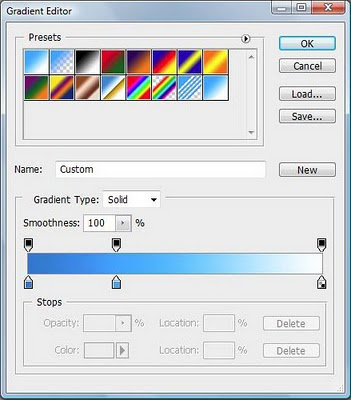
Click on the bottom part of the gradient bar to add a colour. In the picture above, there are 3 points. The first point being a darker blue (007bd1), the 2nd being a lighter blue (00a8ff) at 30% and last one being white.
Drag to colour the square. You will get something like this.
4. Now select the Text Tool and use Verdana. Make your font bold and put a "N" in your square. Pick a nice brighter colour so your letter can be seen. In my case, I made the letter jutting out of the square to make it look nice.
I then added white letters, "EXUS", to show that my example company's name is Nexus. It can be a shape instead of letters too.
5. As it seemed a little too blank, I selected the Custom Shape Tool and selected Ornament 1 to draw at the bottom part of the square. I also made it a little big so it sticks out from the square for some style.
6. Lastly, merge all layers together. Right-click on the layer and apply Stroke with 5 pixels and coloured black.
If you do not like the colour blue, you can also use Hue to adjust the colour you like. You can also add in different shapes or texts and even colours depending on how you want your logo to be.
A good way is to add Drop Shadows and greyish gradients to make the elements in your square more attractive.
Love,
Nicholas.
Wednesday, February 17, 2010
Subscribe to:
Post Comments (Atom)
Blog Archive
-
▼
2010
(1349)
-
▼
February
(64)
- How to Add L4D Custom Content?
- Весна! Прийди!
- Winner Of Challenge 4,,, Lots of Spots
- Totally Papercrafts Challenge :-) Sue's First Sket...
- "Богатырские потешки"
- How to Mod L4D Server?
- Melhoras
- Back again after a nice weekend away. Although th...
- Pinewood Derby
- Early Spring from my MOM and DAD
- С праздником!
- Dogwood Tutorial
- At last...
- Pieces of Spring
- CG Girl Artwork
- WINNER - Challenge #3 - Buttons & Bows
- [Notice] - Blog Inactivity II
- Gaming PRO-ness!
- Cards- longing for springtime
- It has been such a busy week as had my grandchildr...
- Challenge #4 - Lots Of Spots
- Blogs Revisited
- MGS Ipoh Canteen Day
- Somebody Redux
- How to Make a Simple Logo?
- Easter Basket of Eggs
- Cute Denim Font
- С днём святого Валентина
- Празднование масленицы
- Широкая масленица
- I Must Be Someone Now
- Baby_Cuts Font Available for Download
- and the winner is
- Challenge # 3-Buttons & Bows
- On Character Names
- People Silhouette Font..update link to file
- I Made a Dingbat Font with Inkscape
- Today I have been playing with Tilda which I love....
- Google Adsense in Blogger
- Another TWO card
- Gardenia
- "Лидер чтения"
- Note for Angela Who Ordered Files..need email
- TWO are better than ONE...
- I am really enjoying using digi stamps and am tryi...
- Blogs
- Умка-призывник или "Страна, спи спокойно!"
- 70's Mesh/Page Layout
- Big Bowl Logo to Cut on Your Cricut
- How to Search Effectively?
- EIghties Mesh for Sale
- Tags para Perfil do Orkut
- Challenge #2 Recipe
- Some Loving Couples Just in Time for Valentine's Day
- How to Manage a Game Guild?
- Make a Fan!
- Blog Hop Is Now Closed
- How to Make Perfect Milo?
- BIG SISTER
- How to Get a Guy / Girl in IM?
- Crown Returns Home
- Páscoa
- Páscoa
- What is an IP Address?
-
▼
February
(64)
No comments:
Post a Comment