When I was eighteen and on scholarship at art school, being a book cover artist was my dream job. I imagined myself leisurely reading wonderful novels in the park and then spending a month doing grand oil paintings in a sky-lighted studio listening to jazz and drinking wine. I was living in a fantasy world even then.
Turns out illustrators rarely have the luxury of actually reading a book, but then I never got that far. My illustration skills were only good enough to do comps. Finished art was beyond my capability. Keep in mind this was at a time when cars were still often painted rather than photographed and they had to look as realistic as a photo…only better—hence why they didn’t just shoot it. Instead I worked as a designer, a job for which, my illustration skills were overkill.
It wasn’t until my first book, The Crown Conspiracy, was published that my mind returned to this dream. Only it wasn’t a dream anymore; it was desperation that drove me. I had explained what kind of cover I thought the book should have. In my mind I saw it as a loose watercolor, the kind of thing that Alan Lee did for The Lord of the Rings, series, that faint, hazy, mystical look. I pointed out that I really did not want a cartoonishly tight illustration of the characters on the cover.
I’m guessing focus groups have indicated that covers laden with characters attract American readers, as this is what modern marketing dictates for fantasy books. As a seasoned advertiser I knew that it was better to stand out than blend in, but honestly this was a personal desire on my part. Sales be damned, I wanted my books to look nice. Also as a reader I don’t like seeing characters before I know what they look like, and I didn’t want an artist (even if that artist is me) to control the imagination of a reader. I think people will envision what they want, what they like, and what they are comfortable with; this is far better than anything another person could ever achieve with an illustration.
I compiled a list of images that depicted the idea I was after, and my publisher being most polite, listened to my comments then hired an artist.
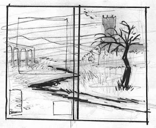
 I soon received this rough sketch and became concerned. As an author, I had no control over the cover or even the title. This was something the publisher’s art director was quick to point out when I protested. But my publisher didn’t know about the dreams of an eighteen-year-old art student.
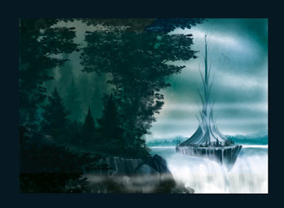
 With encouragement from my wife, I very quickly painted what I wanted to see on my cover. To sweeten the pot I offered it to them for free. I even did a layout of the cover placing the title, my name, and the blurb. They decided to use my artwork although they altered the layout slightly. Having done the first cover they wanted to make them consistent and so I had a lock on all of them. And that’s how I came to have the lucky advantage of controlling the first impression readers have of my books.
I sought to establish a “look” or brand to the series, but I also wanted to separate them from each other in some way. I settled on keeping them all in a similar loose landscape style, but making each in a different color scheme. The first was gold, the second in blue, the third in green. That left me red, purple, and orange. None of them worked. Red, orange, and purple lacked the natural earthy quality of the others. Also the first three reflected the seasons the stories took place in, fall, spring and summer, and Storm took place in fall again. This caused me to consider repeating the colors.
The Emerald Storm became an instant problem because of the name. It should be green, only I don’t want to do two green covers in a row. Moreover, green would be perfect for Percepliquis, and Wintertide must be blue (I knew that from the start.) This left gold for the seafaring novel. As it can be imagined as a sunset or sunrise, I think it works. Still there was that annoying name. I actually considered changing the name for a brief time and created a comp of the cover calling it The Golden Storm. I knew that was wrong, and changed it back. My wife, Robin, eager to show off the new cover posted a copy of the image and it was promptly picked up and has been copied on a few blogs. So if you spot an image of the cover of The Emerald Storm with “The Golden Storm” on the spine, that’s why.
The symbols found on the spines and in the layouts are also my designs and reflect the general concepts within the books and also embody the idea of the medallions given to the heir and guardian.
In case there are those out there interested if your suspicions are correct about the cover images:
The Crown Conspiracy
The cover depicts Essendon Castle on the front cover and on the back is the river Galewyr that leads through the wilderness to the Winds Abby located on the hill on the upper left.

Avempartha
This is a rendering of title’s namesake tower with the Gilarabrywn in the distance. On the back, although not easily seen on the book, is the trail Royce uses to travel between the village and the tower each day.

Nyphron Rising
The image on the front cover is of Amberton Lee and is the scene Royce and Hadrian might have seen as they approached it that night.

The Emerald Storm
I suppose I should wait on explaining the Storm’s cover. No need to give anything away when we’re so close.

So as long as this series is in production I have a pretty steady job as a book cover artist, the trick it turns out is to write your own books.


.jpg)
.jpg)

.jpg)
.gif)


No comments:
Post a Comment